Paws Chicago
PAWS Chicago had built something rare: a brand people genuinely loved. But that love had also kept it frozen in time. Since its inception, the identity had remained largely unchanged, creating a narrow creative sandbox where evolution felt risky and even small shifts carried weight. The logo, in particular, wasn’t just a mark, it was a symbol of trust, making any change feel less like design and more like surgery.
Our task was to move the brand forward without breaking what made it meaningful in the first place. We set out to thread that needle, honoring the equity that had been built while creating a system that could grow with the organization’s ambition. The result was a refined identity anchored by a unifying symbol designed to capture the full story of PAWS Chicago, not just what it does, but why it exists, giving the brand room to expand while keeping its heart exactly where people expect it to be.
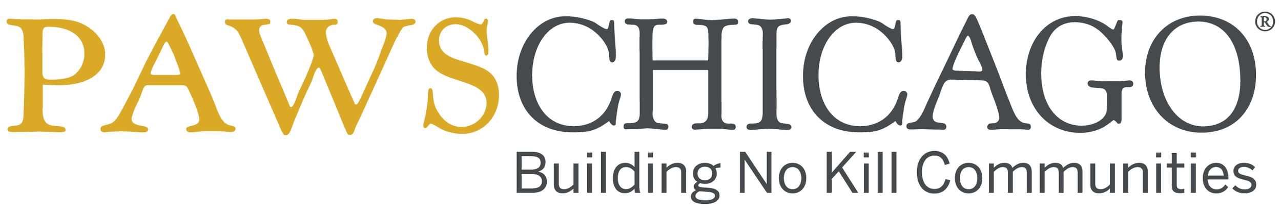
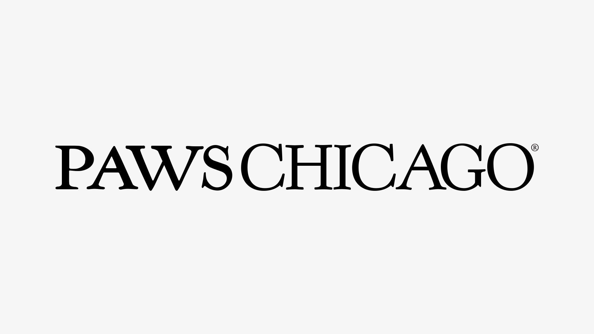
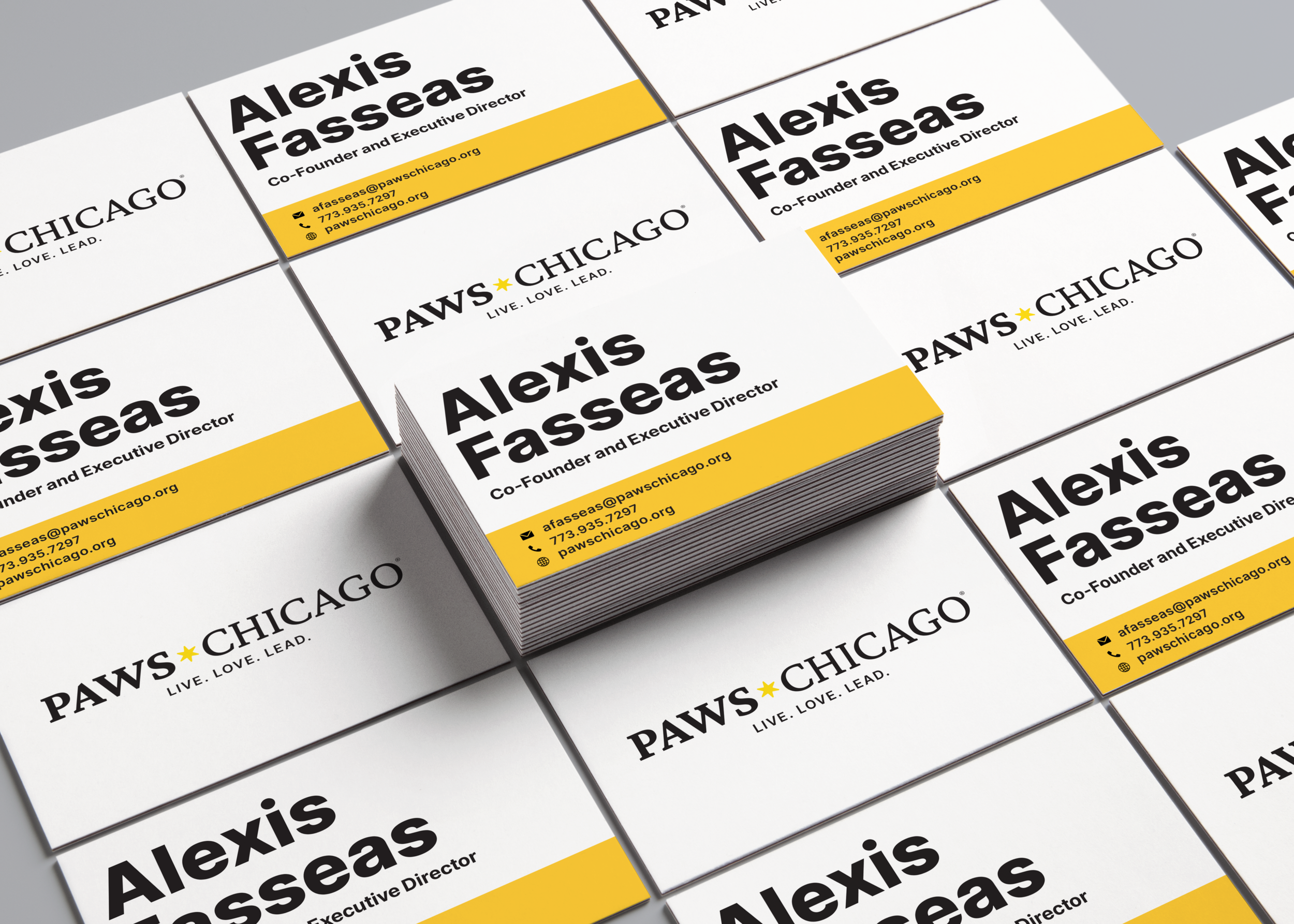
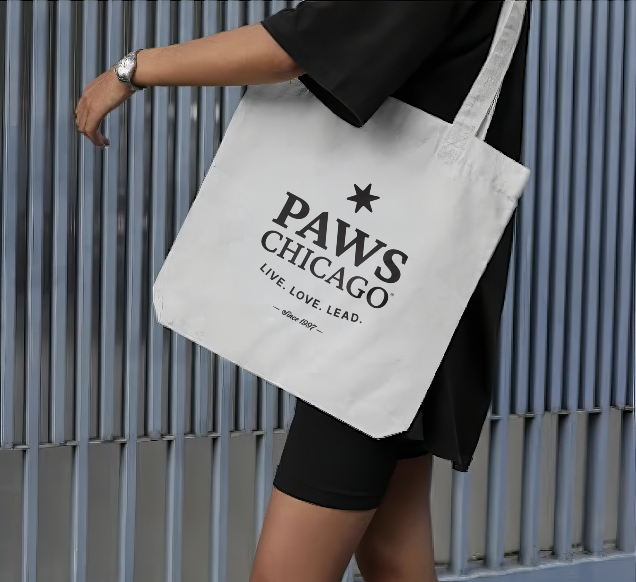
As we looked more closely at the existing wordmark, we found subtle irregularities in the letterforms, small inconsistencies that worked at smaller sizes but began to break down when scaled. On a screen or brochure, they felt human, even charming. But at the size of a building, those same quirks started to read like mistakes. Rather than force a fix, we selected a new typeface that honored the spirit of the original while performing far better across today’s small-screen environments and large-scale applications alike, giving the brand clarity, consistency, and room to grow.
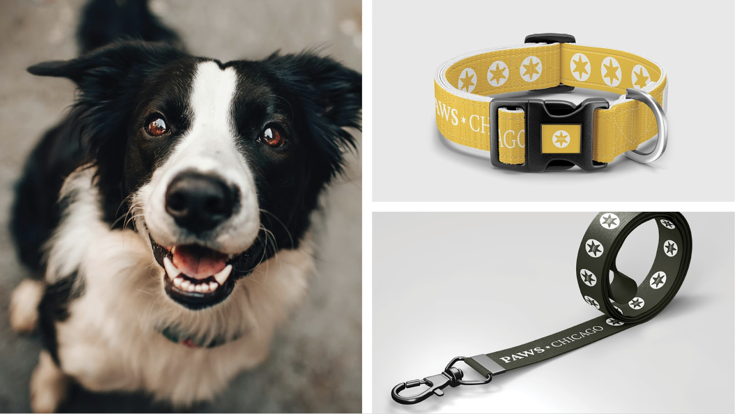
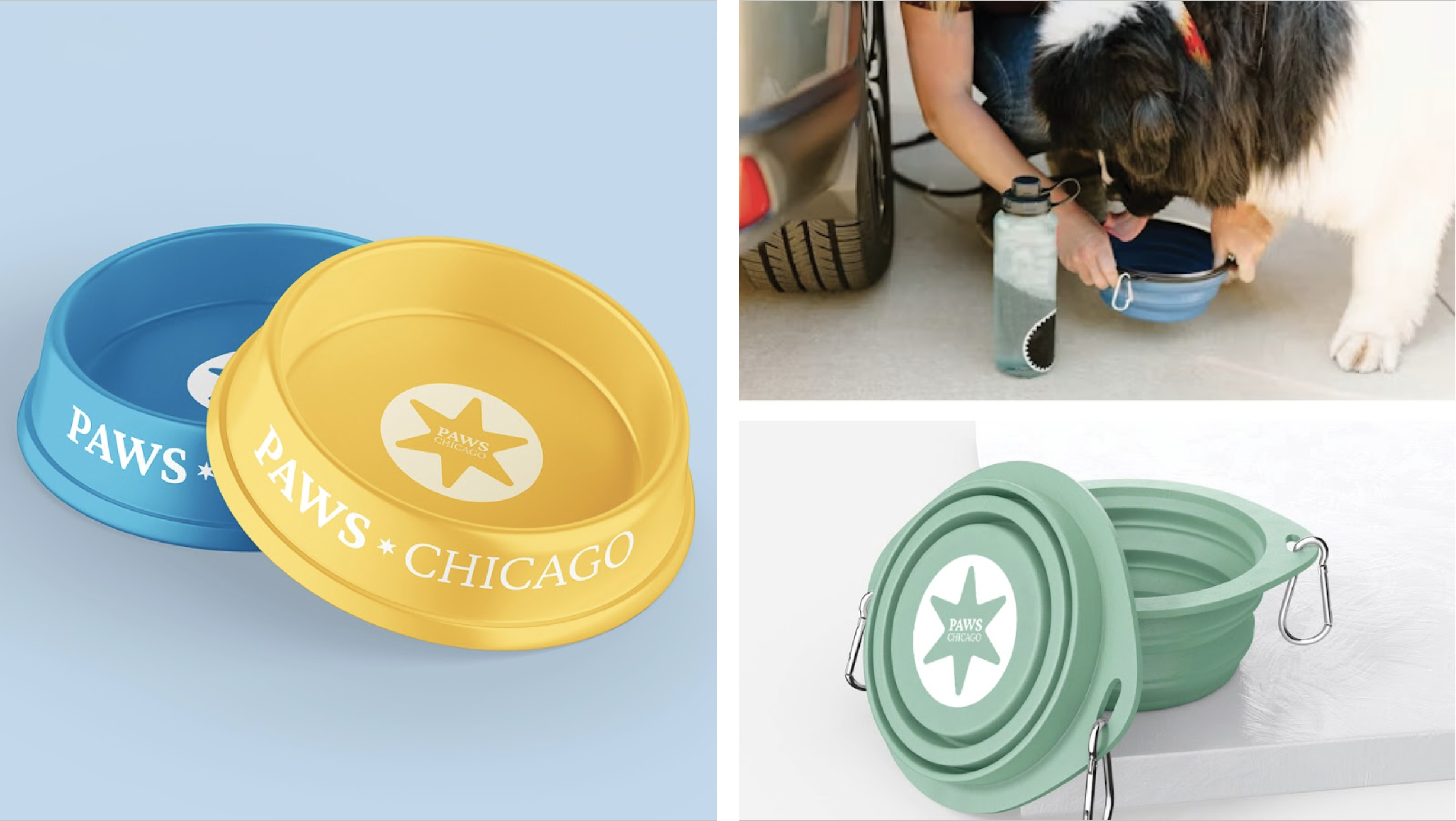
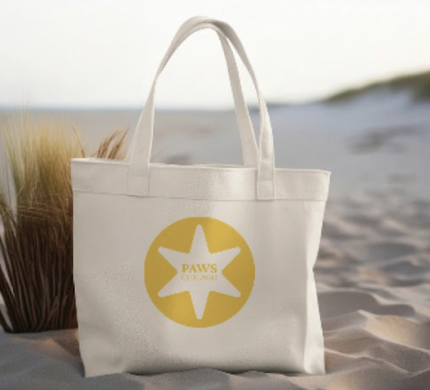
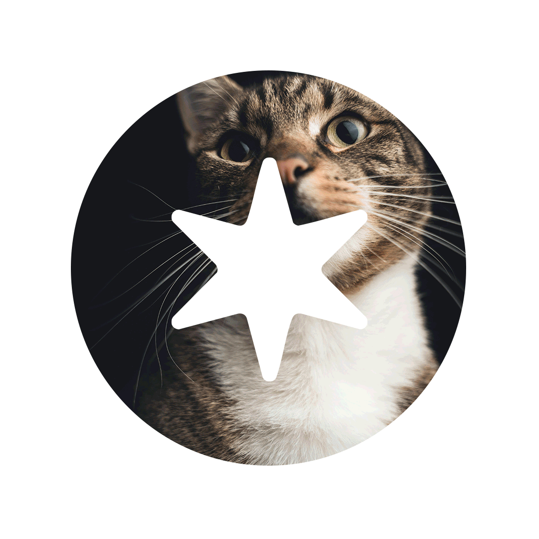
The next challenge was creating a symbol the organization could truly own, one that grounded the brand in its Chicago roots while connecting directly to its core pillars. It had to carry meaning without leaning on the obvious. In a category crowded with paw prints, tails, and wide-eyed illustrations, PAWS Chicago was clear: no clichés, no cutesy animals. What emerged was a mark built with intention, something more iconic than illustrative, designed to represent impact, structure, and purpose. A symbol that feels rooted in place, aligned with mission, and distinct enough to stand apart in a sea of sameness.
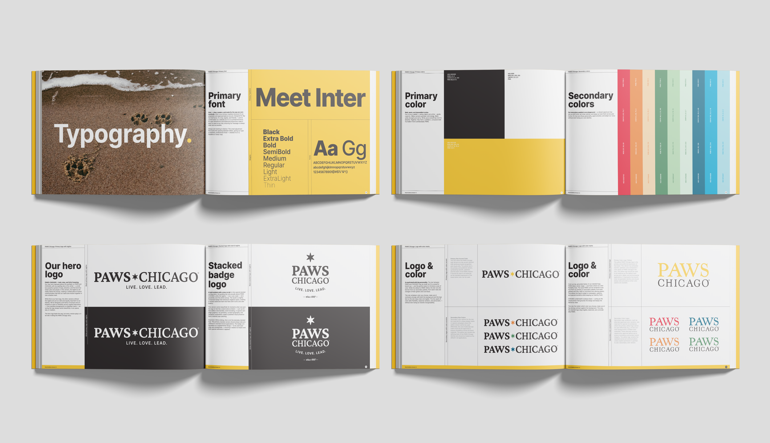
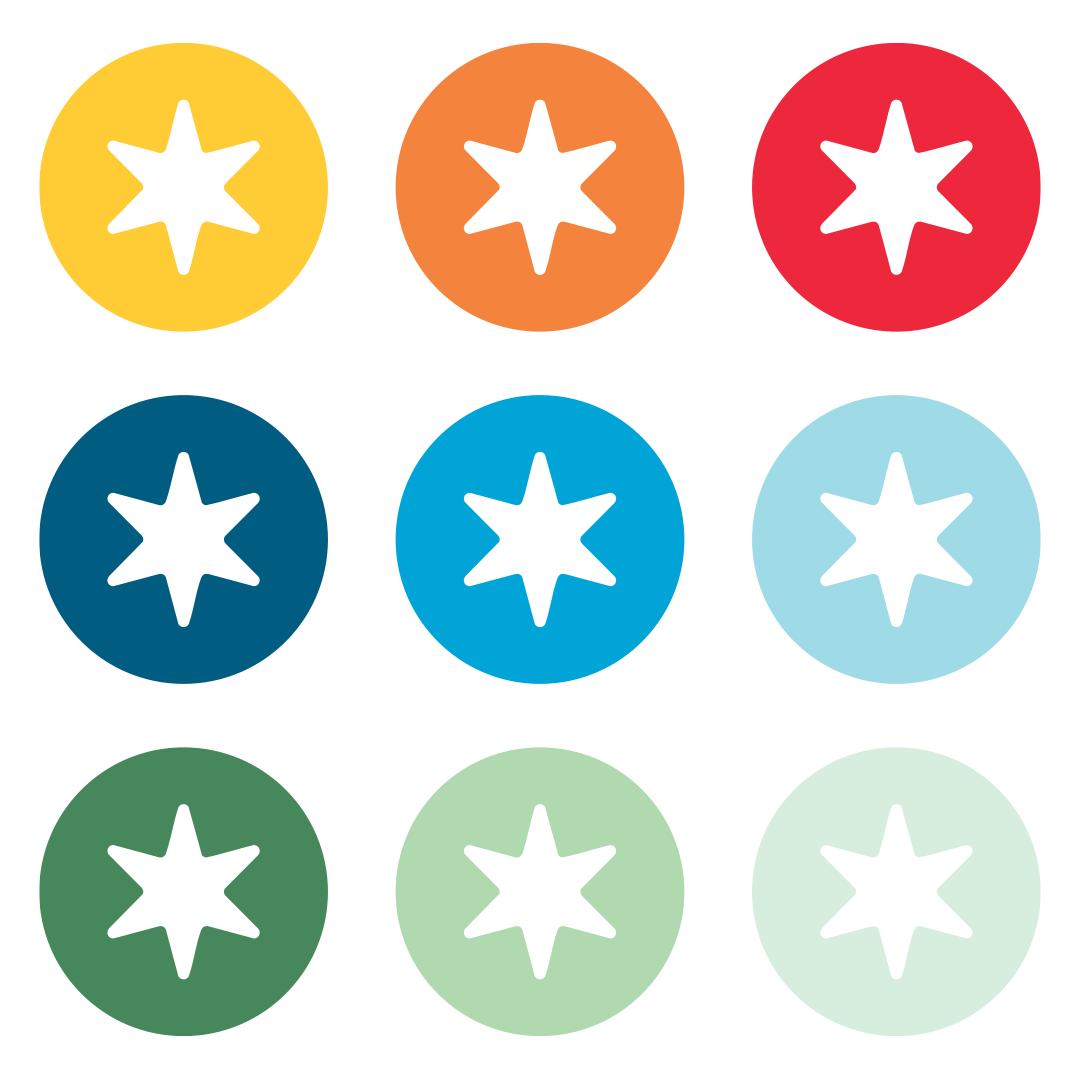
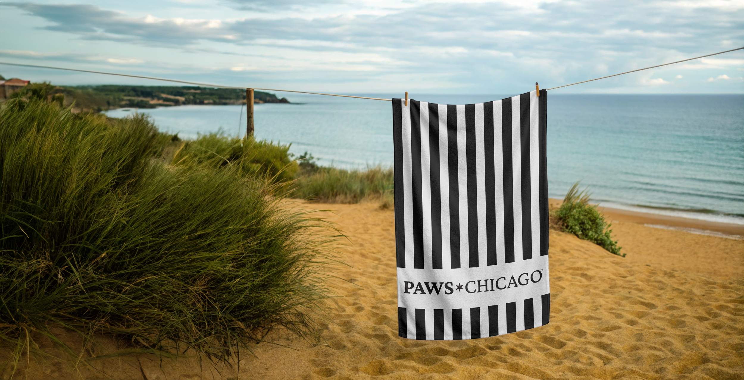
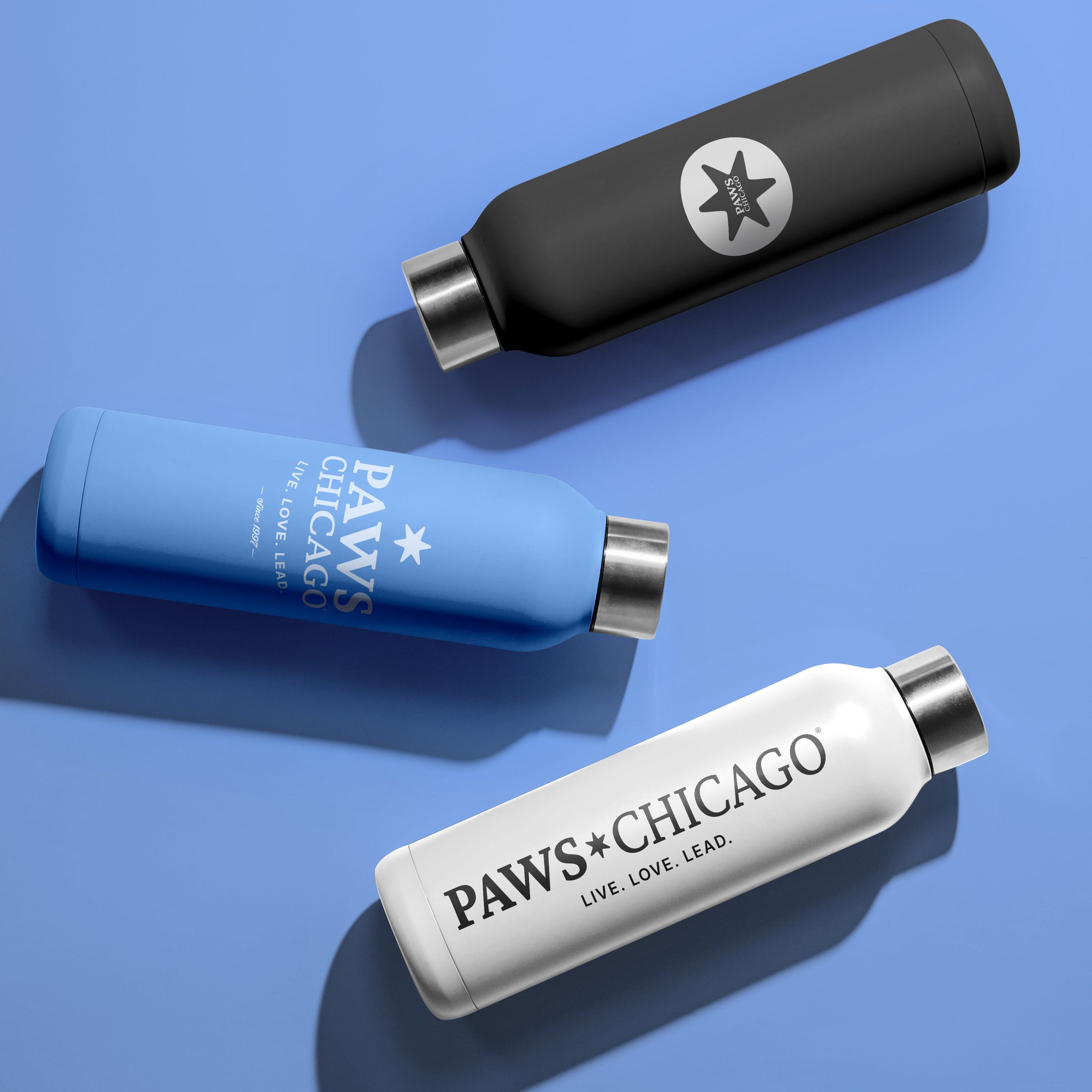
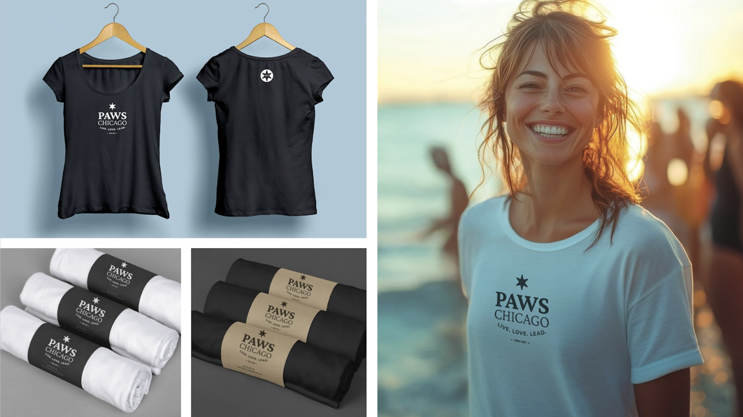
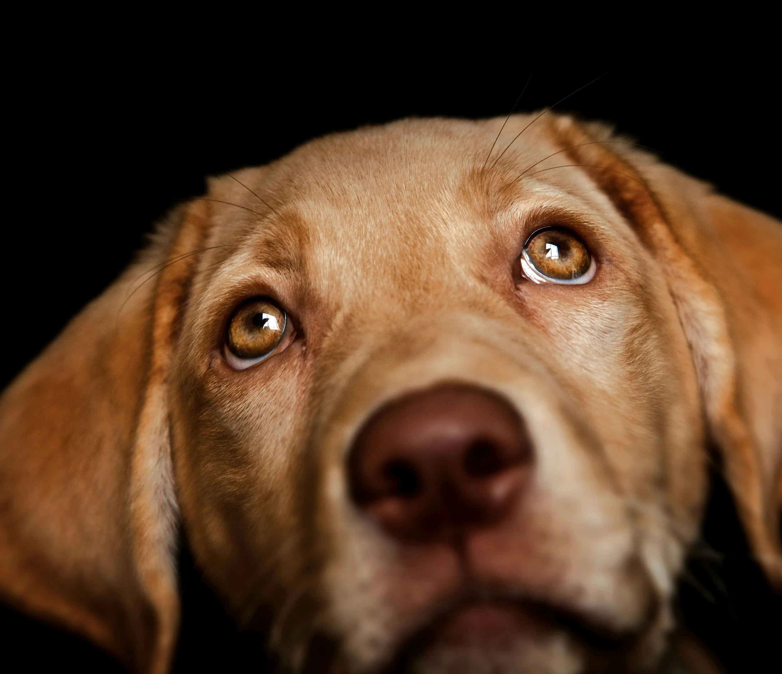
We approached the rebrand with restraint, stripping it back to what mattered most. A field of black and white created clarity and focus, allowing the work, and the animals, to speak without distraction. Into that simplicity, we introduced yellow as a signal of hope, warmth, and forward motion. Used sparingly, it becomes unmistakable, a quiet but confident thread that ties everything together. A secondary color palette was introduced as well, applied thoughtfully and sparingly to denote specific areas of the organization, adding structure without clutter. The result is a system that feels open, optimistic, and distinctly PAWS Chicago, where the brand supports the story without ever overpowering it.
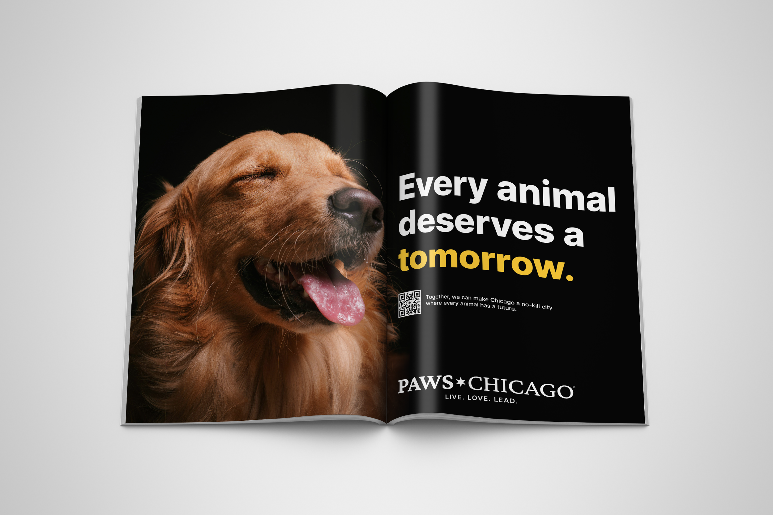
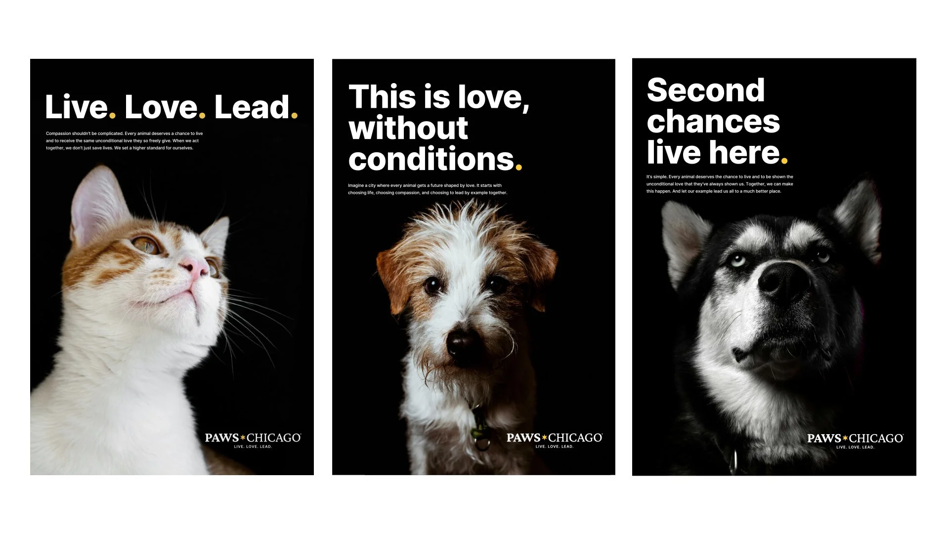
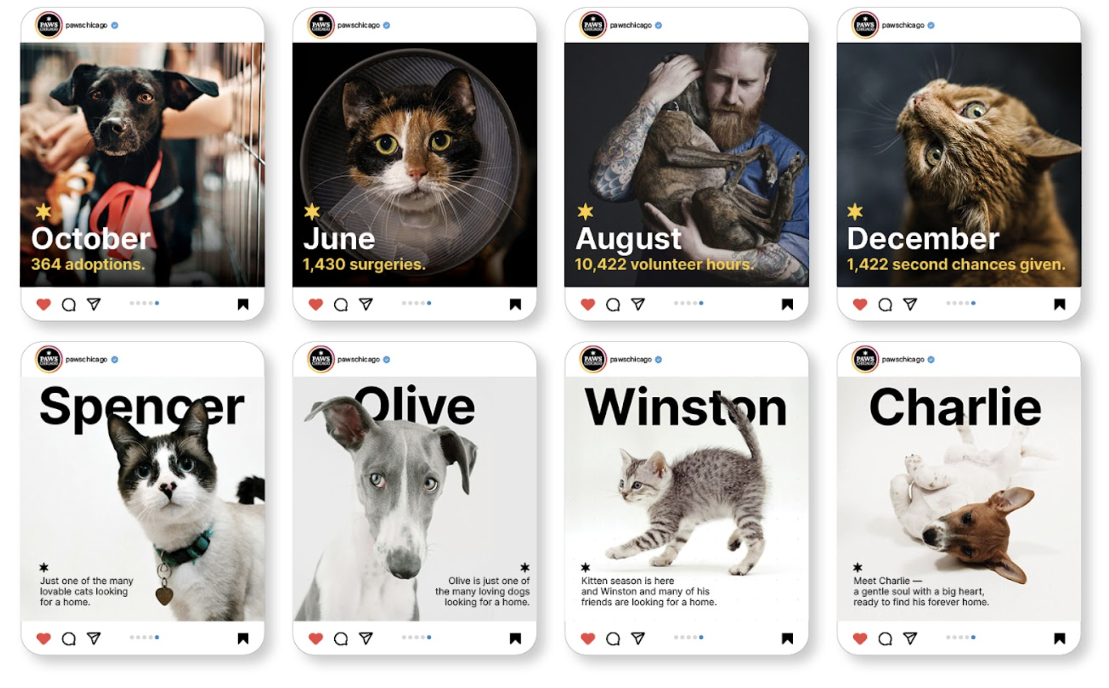
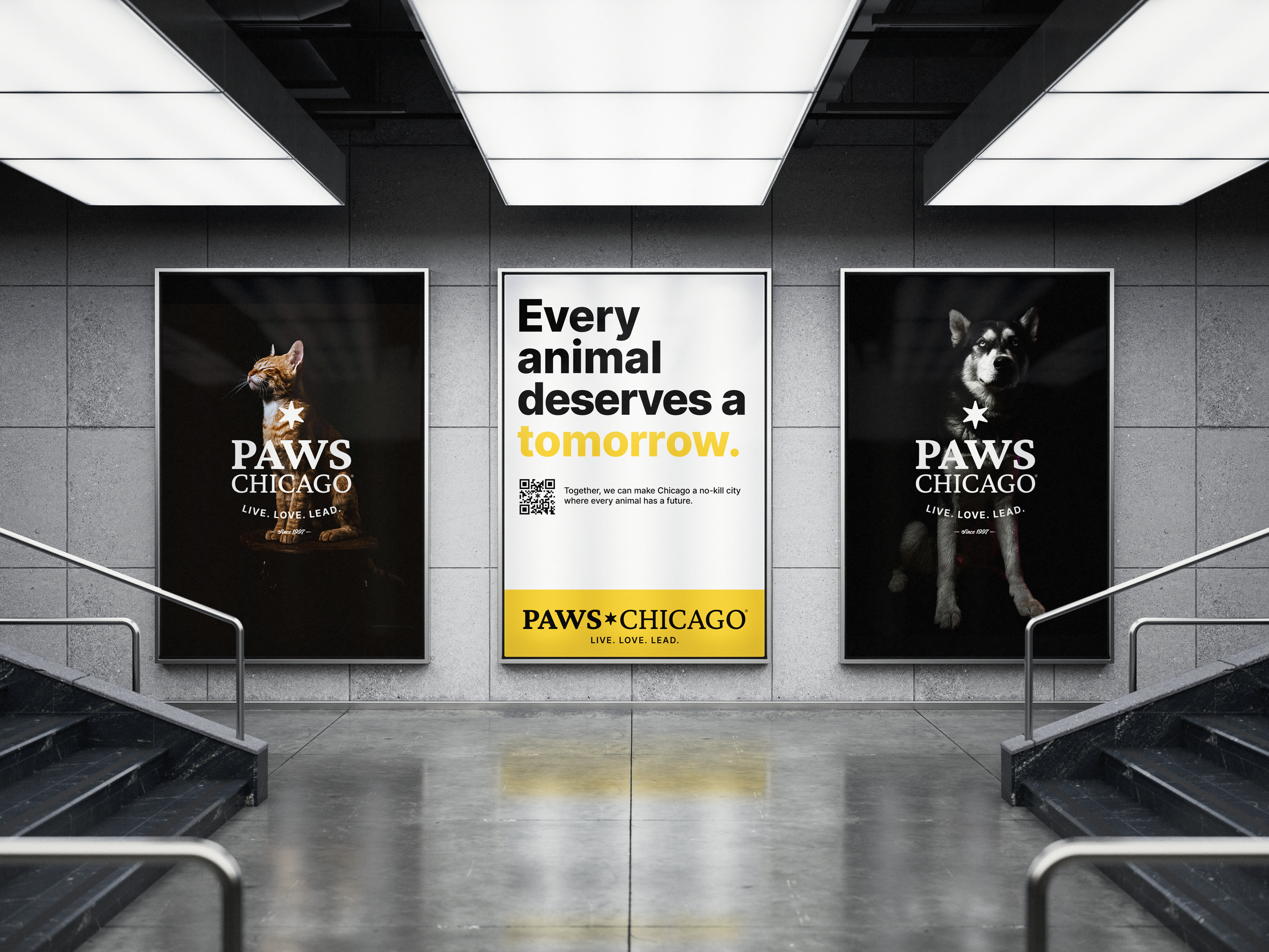
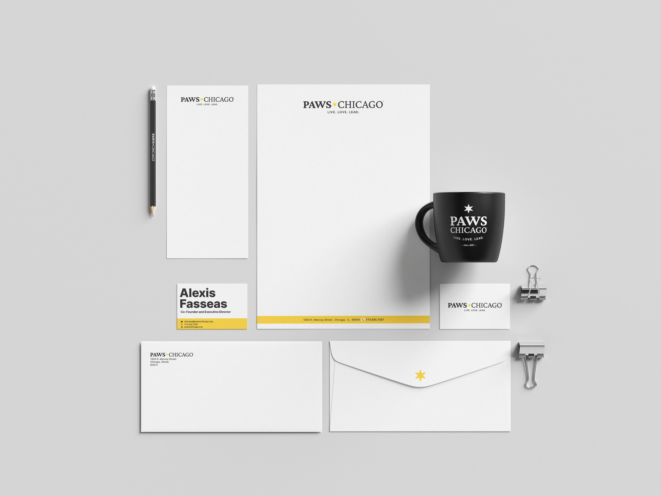
The result was a system designed to travel well. Clean, intuitive, and easy to use, the brand flows seamlessly across everything from digital and social to signage, environments, and everyday swag. It gives teams a clear framework without boxing them in, allowing consistency without killing flexibility. Whether it’s a billboard, a volunteer T-shirt, or a simple social post, the identity holds together effortlessly, making it easy to show up as one cohesive voice wherever PAWS Chicago lives.