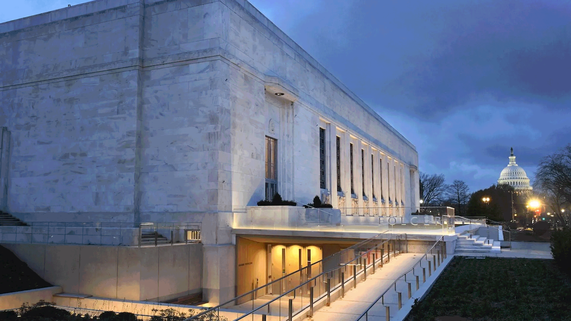
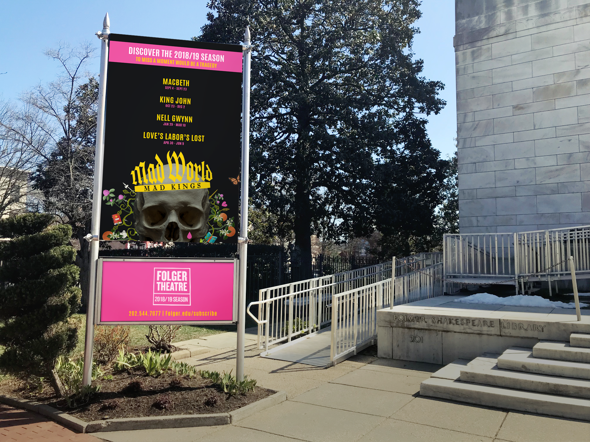
Folger Theater
For decades, the Folger Theatre has been one of Washington, D.C.’s most respected cultural institutions. An intimate, 250-seat space tucked inside the Folger Shakespeare Library, it is known for fearless performances, deep scholarship, and a rare Elizabethan-style theater that puts audiences within arm’s reach of the work. The pedigree is unquestionable. The challenge was relevance. For the 2018–2019 theatrical season, the question wasn’t how to attract loyal theatergoers. It was how to reach a younger, culturally curious audience who didn’t consider themselves “theater people,” and who likely carried baggage around Shakespeare being academic, inaccessible, or simply not for them. Asking them to buy tickets, invest emotionally, and step into a centuries-old canon required more than tradition. It required disruption.
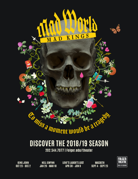
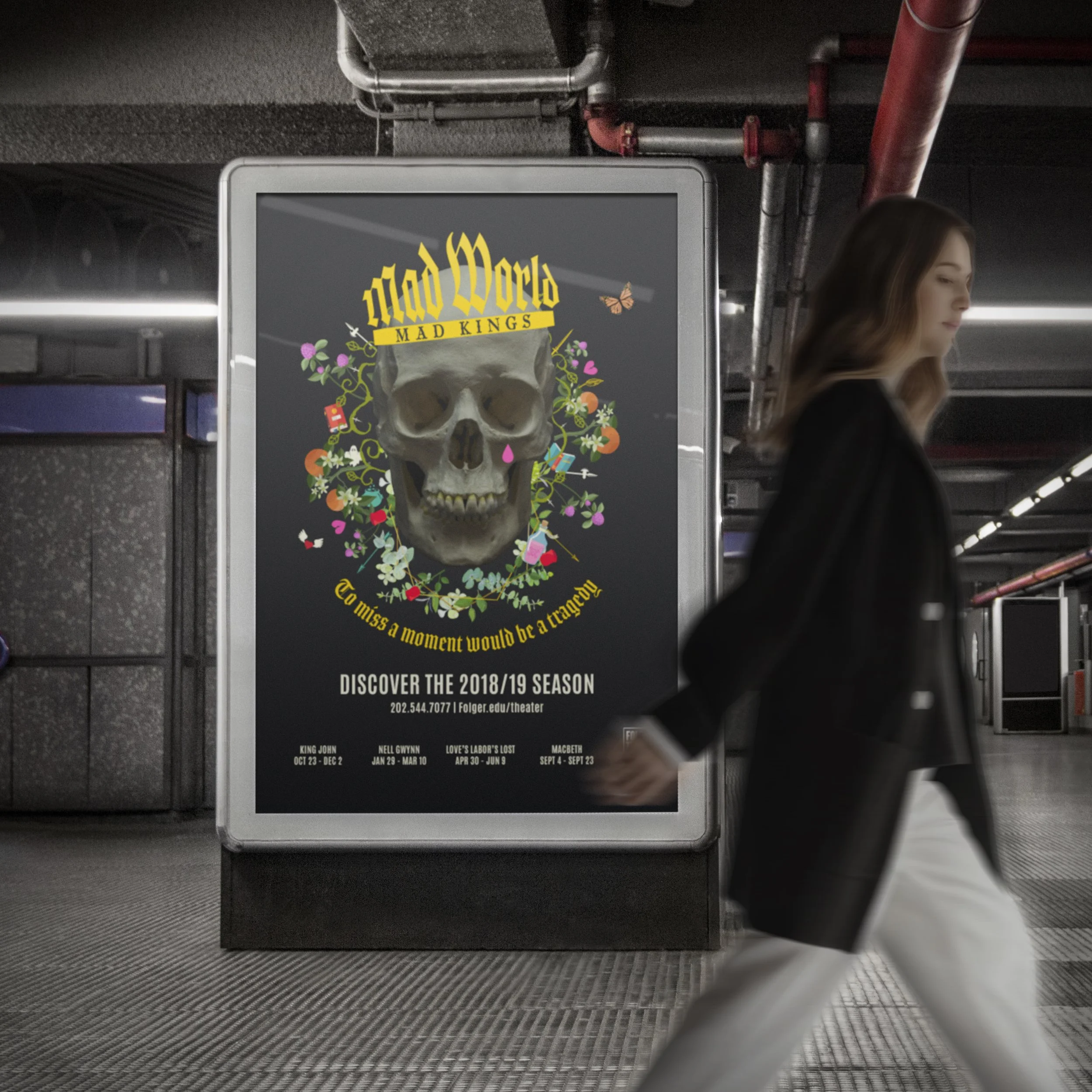
Our answer was Mad World, Mad Kings. Instead of leaning on familiar Shakespearean tropes, we deliberately broke them. We embraced edgy, contemporary design and bold visual language that felt confrontational, modern, and alive. The campaign rejected dusty quills and polite portraits in favor of something sharper, darker, and more urgent, reframing Shakespeare as chaotic, political, and wildly relevant. Not as homework, but as an experience. The goal wasn’t to soften Shakespeare. It was to make him dangerous again, and invite a new audience to step inside the madness.
Roll > Freelance Art Director / Designer | ACD: Efrat Levush
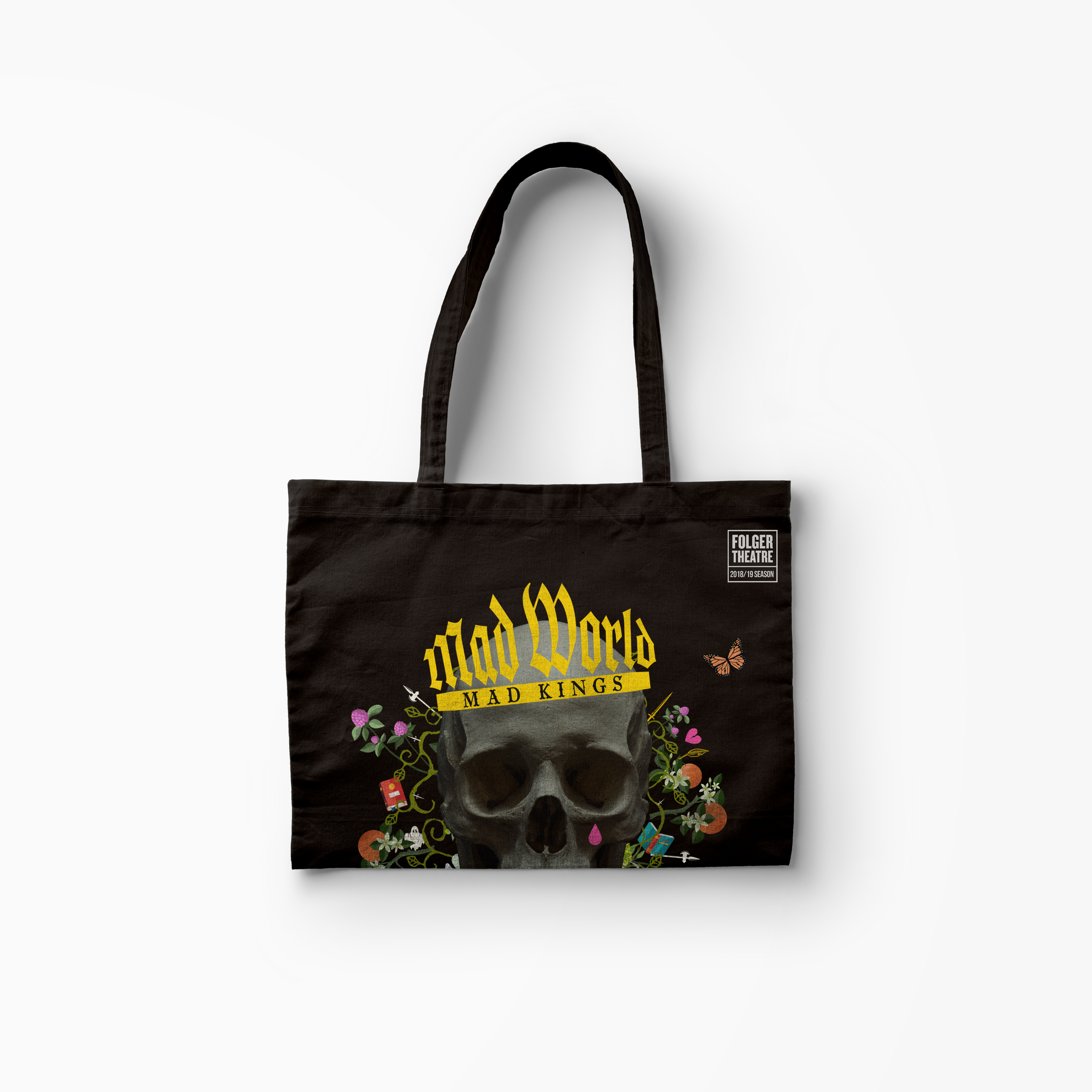
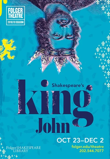
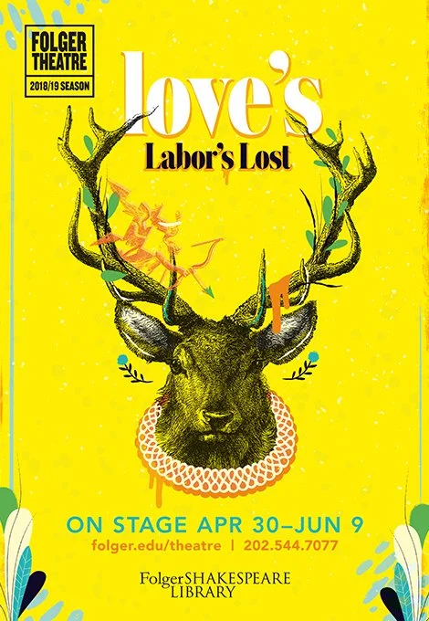

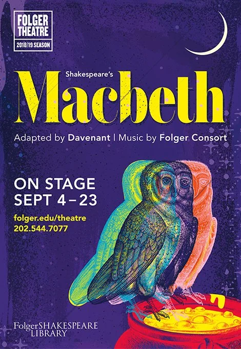
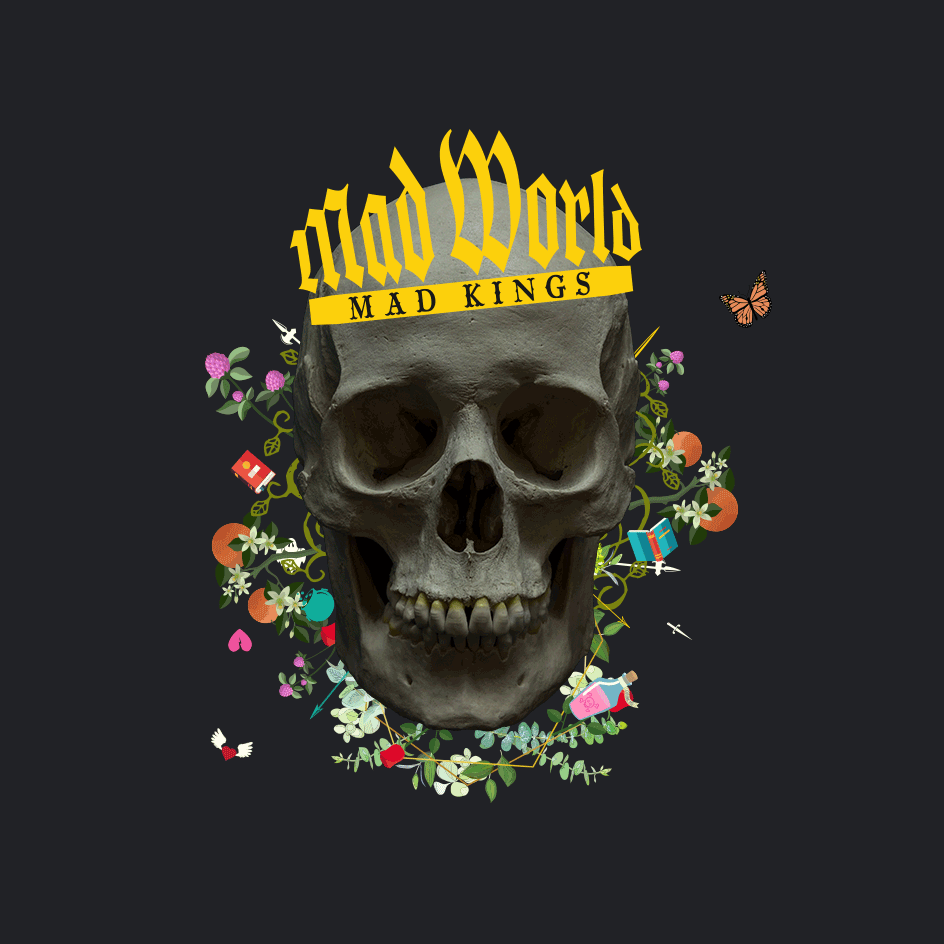
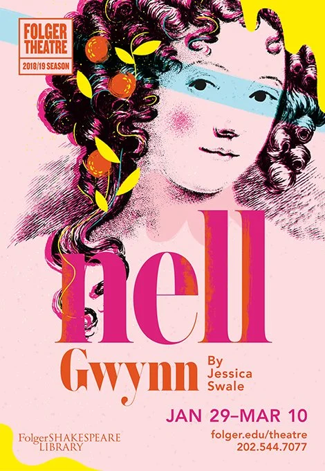
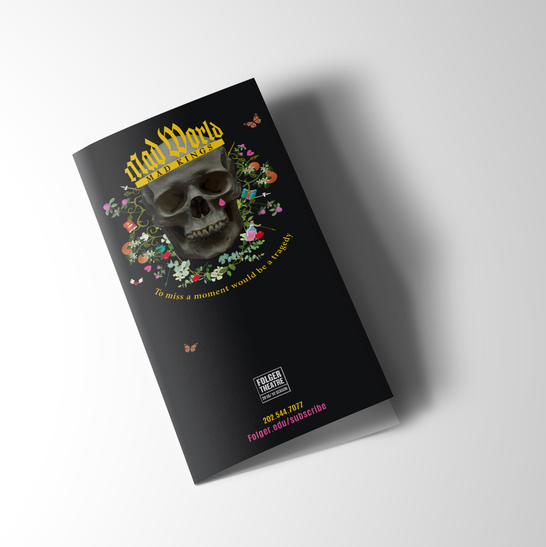
To bring the season to life visually, we created a custom poster for each production, collaborating with Andrew Bannecker to give every play its own distinct voice. Each poster was designed as a bold, standalone statement, capturing the tone, tension, and modern edge of the work while still feeling unmistakably part of the Mad World, Mad Kings universe. Together, they formed a cohesive system that treated each production not as a footnote in a season lineup, but as a cultural event worthy of its own spotlight.
Lluminaire Salon
For decades, the Folger Theatre has been one of Washington, D.C.’s most respected cultural institutions. An intimate, 250-seat space tucked inside the Folger Shakespeare Library, it is known for fearless performances, deep scholarship, and a rare Elizabethan-style theater that puts audiences within arm’s reach of the work. The pedigree is unquestionable. The challenge was relevance. For the 2018–2019 theatrical season, the question wasn’t how to attract loyal theatergoers. It was how to reach a younger, culturally curious audience who didn’t consider themselves “theater people,” and who likely carried baggage around Shakespeare being academic, inaccessible, or simply not for them. Asking them to buy tickets, invest emotionally, and step into a centuries-old canon required more than tradition. It required disruption.
Dawn of The Dead
Created as a promotional piece for Cade Martin, this collaboration serves as a tribute to one of horror’s true greats in honor of the greatest holiday of all: Halloween. Built to showcase Cade’s cinematic eye and command of mood, the work leans into classic genre tension, using restraint and suggestion to let atmosphere carry the story.
> Role: Creative Art Director Photographer/ Film maker: Cade Martin
The Projectionist
This project grew out of a shared desire to simply make something together. When Eli Meir Kaplan invited me into the early thinking, we worked side by side to shape the story, starting with a simple idea and letting it evolve naturally. The result was The Projectionist, a quiet, heartfelt story of true love built through collaboration.
NCTA
We created a pair of PSAs for the National Cable & Telecommunications Association that humorously exaggerate how far parents might go to protect their kids from the darker corners of cable TV, zombies, gore, potty language, and everything in between.
The work plays on parental anxiety and well-meaning overreaction, flipping it into a simple truth: the technology is already there. Parental controls work. You just have to push a button.
> Role: ACD / Art Copy / ACD: Trever Naud
As you might imagine, the holiday season at Walmart is more chaotic than a snow globe in a paint shaker. Everyone’s stressed, everything’s urgent, and somehow it’s still only December 3rd. Instead of pretending this was magical and serene, we leaned into the truth.
We built a campaign that felt real, human, and unapologetically funny, capturing the lovable madness of families doing their best under holiday pressure. It landed so well that USA Today even picked up the story, including one particularly determined kid attempting to catch Santa with a rope. Which felt about right.
Xbox
Pulling players into the game, not just the soundtrack
In late 2005, Microsoft was preparing to launch the Xbox 360 and needed its first wave of games to do more than look impressive. At the time, most video game advertising followed a familiar formula: gameplay clips cut to loud music. Effective, maybe. Memorable, rarely. Our challenge was different. How do you make fans feel like they’re already inside the game world before they ever pick up a controller?
Perfect Dark Zero
For Perfect Dark Zero, the goal was tension and intrigue. As a marquee shooter and prequel to a cult classic, the game introduced a new generation to Joanna Dark while showcasing Xbox Live’s early multiplayer ambitions. The spot focused less on raw gunplay and more on atmosphere, espionage, and scale, positioning the game as a cinematic experience first, a shooter second.
Our answer was immersion. Instead of cutting music videos, we built commercials that dropped viewers directly into the universes of three flagship launch titles, treating each game like a world worth entering, not just a product to watch. The work was widely praised for feeling cinematic, confident, and distinctly different from the category norm, helping set the tone for what “next-gen” actually meant.
The approach mirrored the game’s reception. Perfect Dark Zero launched alongside the console to strong reviews, earning praise for its ambitious multiplayer modes and modernized take on a beloved franchise, and quickly became one of the Xbox 360’s early commercial successes.
Project Gotham Racing 3
Project Gotham Racing 3 was a technological flex, and the work leaned into that confidence. Instead of a highlight reel of laps, the commercial immersed viewers in the sensation of speed, style, and control, echoing the game’s celebrated Kudos system. It wasn’t about finishing first, it was about how you drove.
Critics and players agreed. Widely regarded as one of the strongest launch titles for the Xbox 360, PGR 3 was praised for its stunning HD visuals, stylish gameplay, and next-generation presentation, often cited as a benchmark for what the new console could do.
Kameo: Elements of Power
With Kameo: Elements of Power, Rare delivered a vibrant, imaginative counterpoint to the launch lineup. The spot embraced scale, color, and transformation, inviting viewers into a fantastical world where character-switching felt magical, not mechanical.
The game itself was celebrated for its inventive combat, bold art direction, and technical polish, becoming a fan-favorite showcase for the Xbox 360’s visual power and a reminder that next-gen didn’t have to mean gritty to be impressive.
The Result
Together, these commercials became Xbox’s first creative statement heading into the Xbox 360 era. The work was widely praised for elevating video game advertising beyond montage and music, while the games themselves launched to strong reviews, critical acclaim, and commercial success.
Instead of selling features, the campaign sold immersion. Not just better graphics, but richer worlds. And in doing so, it helped define how next-generation games would be introduced to players from day one.
Walmart
Common Core
Few phrases ignite parental panic faster than “Common Core.” It arrived loaded with confusion, suspicion, and more than a little rage. This animated film set out to cut through the noise, stripping away rumor, hearsay, and fear to get back to the truth.
By showing how the standards were designed to help students think, solve problems, and grow, the work reframed Common Core not as an enemy in the kitchen at homework time, but as a tool meant to support learning, not tears.
> Role: ACD / Art Copy / ACD: Mimi Tan
Virgin Mobile
Spring break is a special kind of chaos. Sunburns, bad decisions, and relationships with a very clear end date. College students aren’t heading to Cabo looking for lifelong commitments. They want freedom, flexibility, and zero strings attached. Which made it the perfect metaphor for Virgin Mobile.
Virgin Mobile’s model was just as honest: pay as you go, no contracts, no long-term commitment. So instead of explaining it with telecom jargon, we let culture do the work. The spot leaned into the familiar, no-judgment reality of spring break hookups, delivering a knowing wink that landed because it was true. The result was a commercial that cut through with humor and relevance, making the brand’s promise instantly clear.
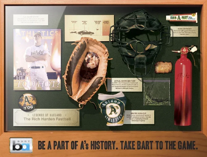
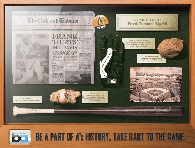
Oakland A’s
Baseball advertising has a habit of taking itself very seriously. Stoic stares. Slow-motion dirt kicks. A lot of “tradition.” That wasn’t the Oakland A’s. So instead of pretending they were something they weren’t, we leaned hard into who they actually were: scrappy, joyful, a little weird, and clearly having more fun than the teams across the country trying very hard to look important. Think less pinstripes, more playground.
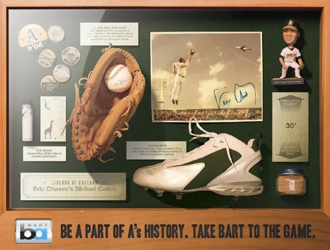
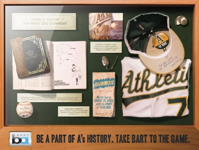
The spot showed the players as big kids, loose, curious, and human. Guys you’d want to sit next to in the bleachers, not salute from afar. It made the A’s feel approachable, un-stodgy, and proudly not the Yankees. The result was a commercial that didn’t sell baseball as a cathedral, but as a good time, reminding fans that this team plays with heart, humor, and a genuine love of the game.
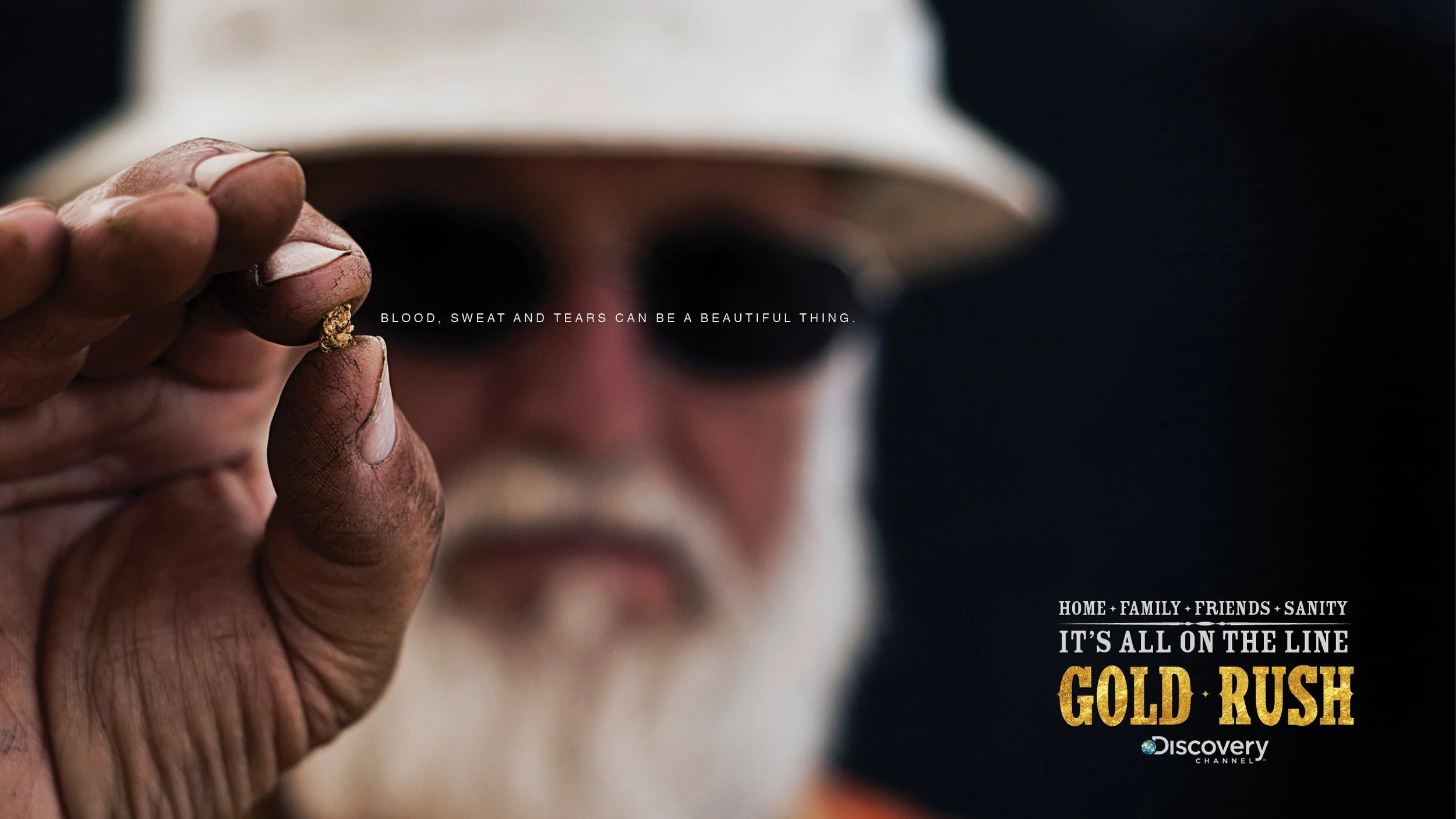
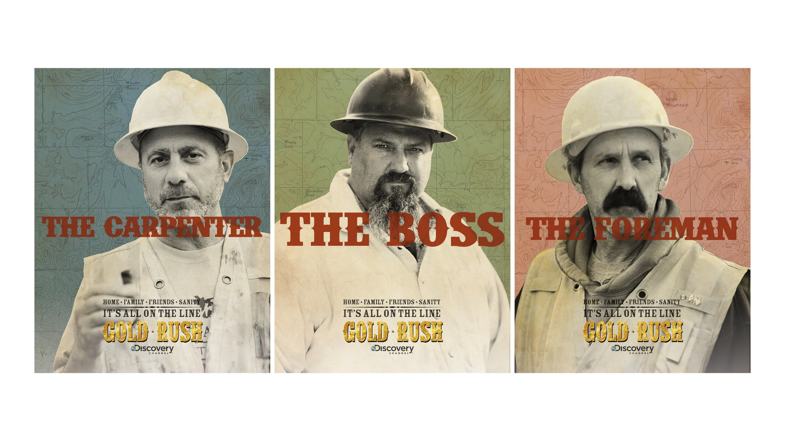
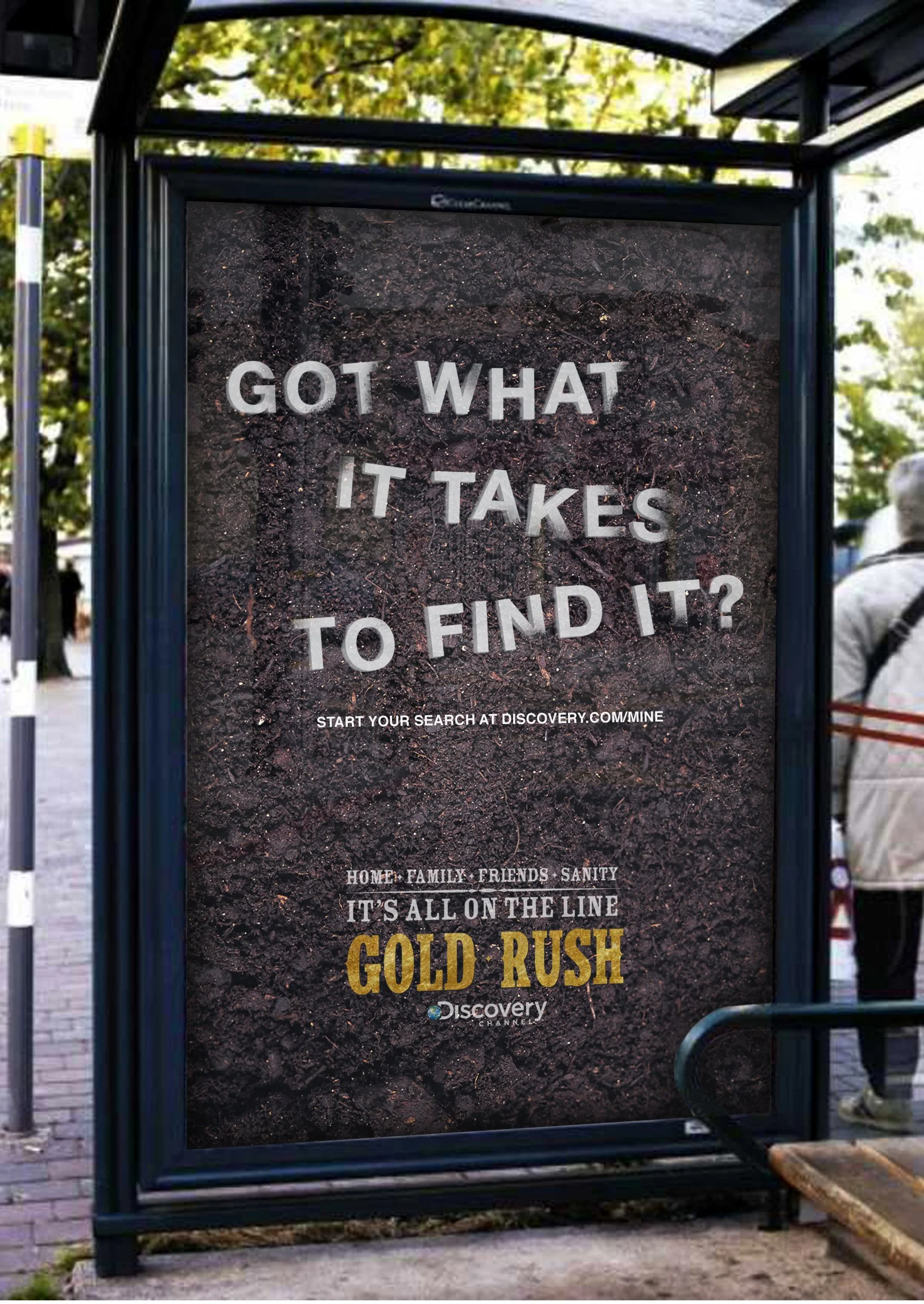
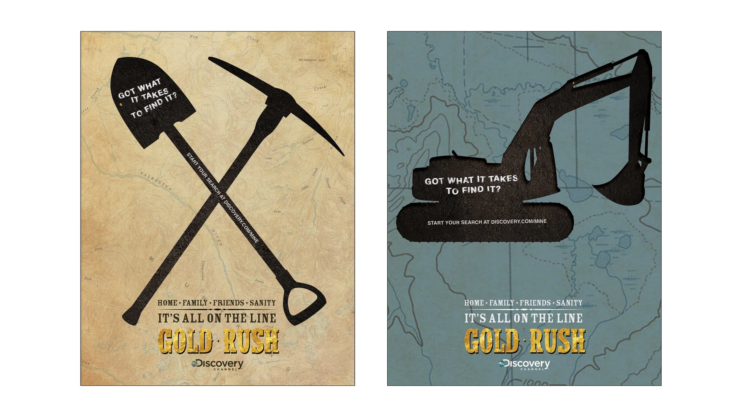
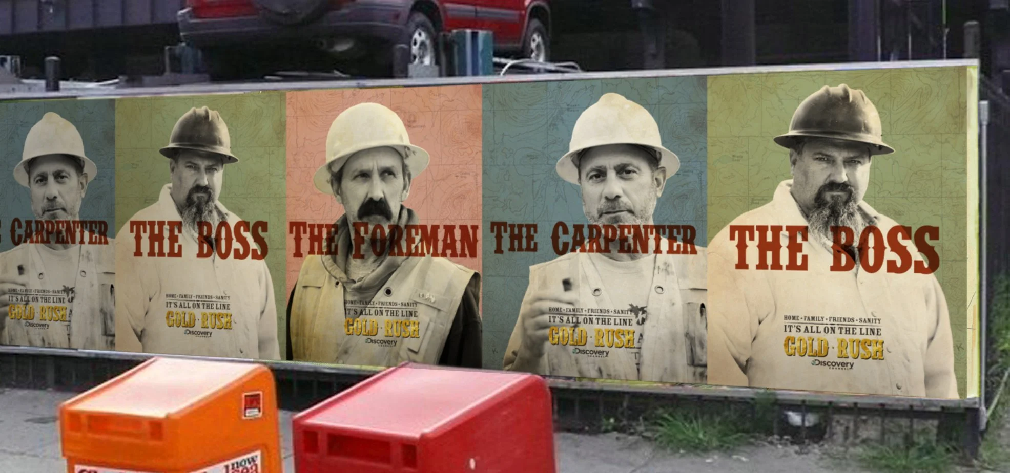

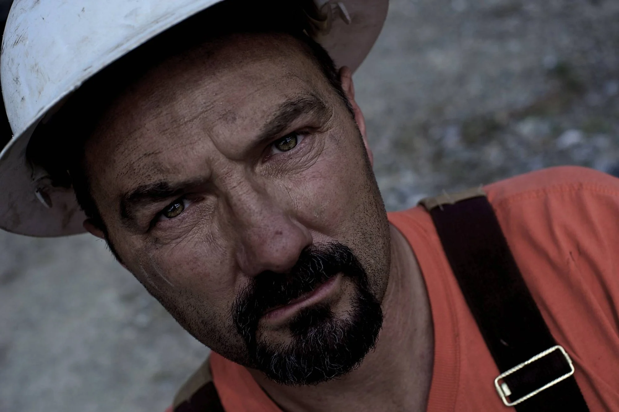
Discover Channel
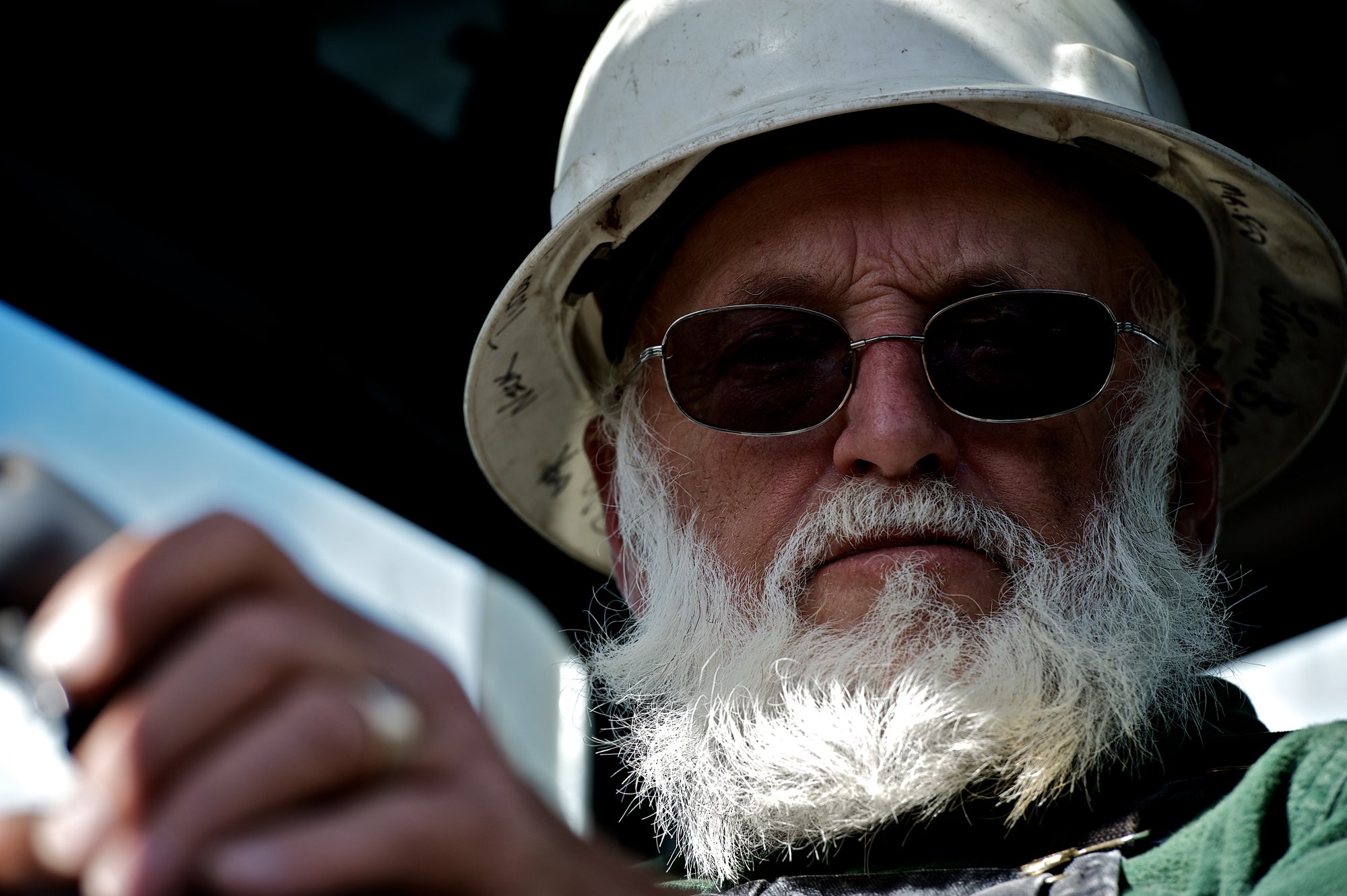
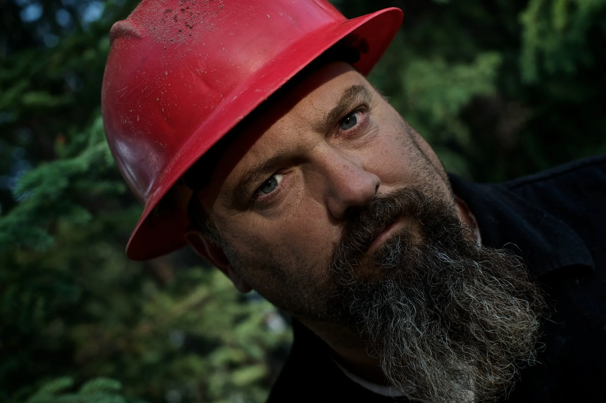
Promoting reality TV usually comes with a familiar playbook: loud graphics, bigger voices, and a lot of forced drama. Gold Rush easily could’ve gone that route. Instead, we chose restraint. Rather than hyping the spectacle, we focused on the people. The ones who wake up before sunrise, destroy their bodies for a chance at something better, and do it all again the next day.
The campaign stripped away the cheese and leaned into the art and soul of the miners themselves. Grit, exhaustion, obsession, and hope became the story. By grounding the work in the emotional and physical grind these characters live day in and day out, we transported viewers into their world, not as spectators of reality TV, but as witnesses to a hard-earned way of life.